
LinkedIn Wellness Brand
ART DIRECTION + BRANDING
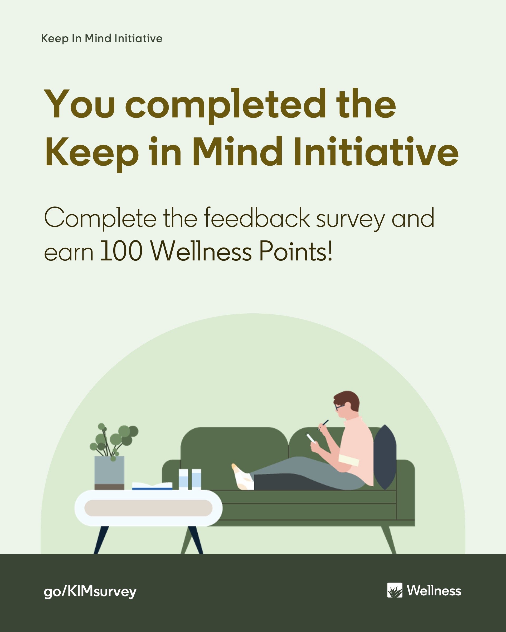
I led the design of the Wellness brand mark, which is used globally across LinkedIn offices. The goal: craft a visual identity that is aligned with the program’s progressive nature, cohesive with LinkedIn’s broader brand, and looks good on a hoodie. Why a hoodie? As an incentive, hoodies and other Wellness SWAG can be purchased by redeeming Wellness Points, which are earned by engaging in the program.

ART DIRECTION
Like plants need sunlight, soil, and water to thrive, humans need more to flourish—enter the 6 Tenets of Wellness: Thoughts, Breathing, Hydration, Nutrition, Movement, and Rest.
The new logo integrates LinkedIn’s “in” bug with the silhouette of an agave plant—symbolizing healing and resilience. Its six leaves represent each of the six tenets.

Now, please enjoy a smattering of things the Wellness logo has touched or lived on, including social posts, digital display ads, physical event banners, printed handouts and the like—which, if we’re taking credit for things, were also created by me.
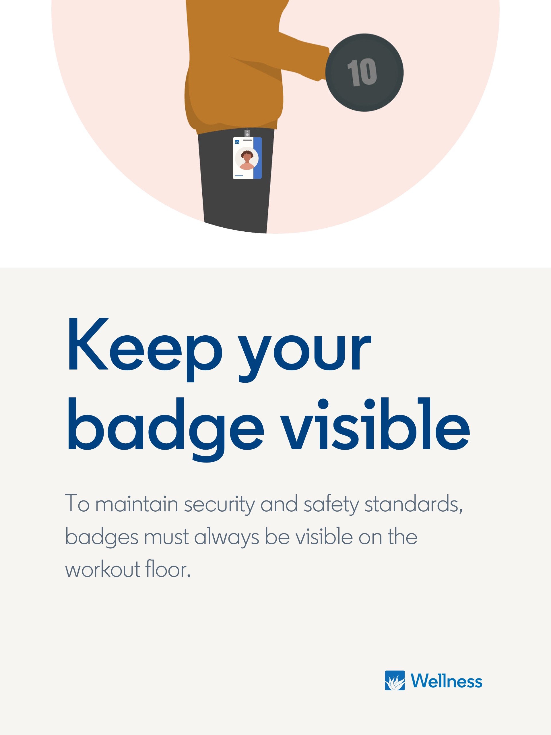
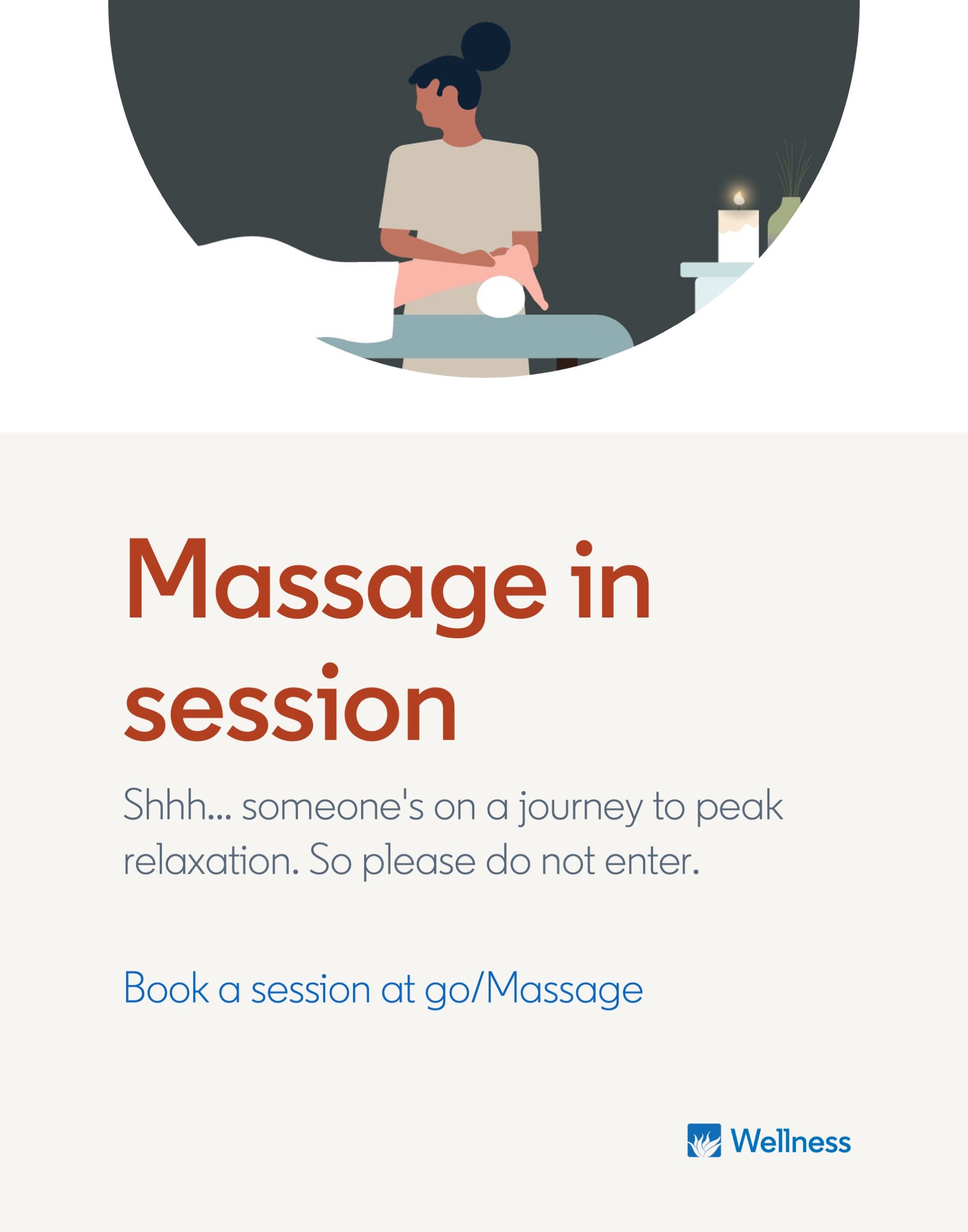
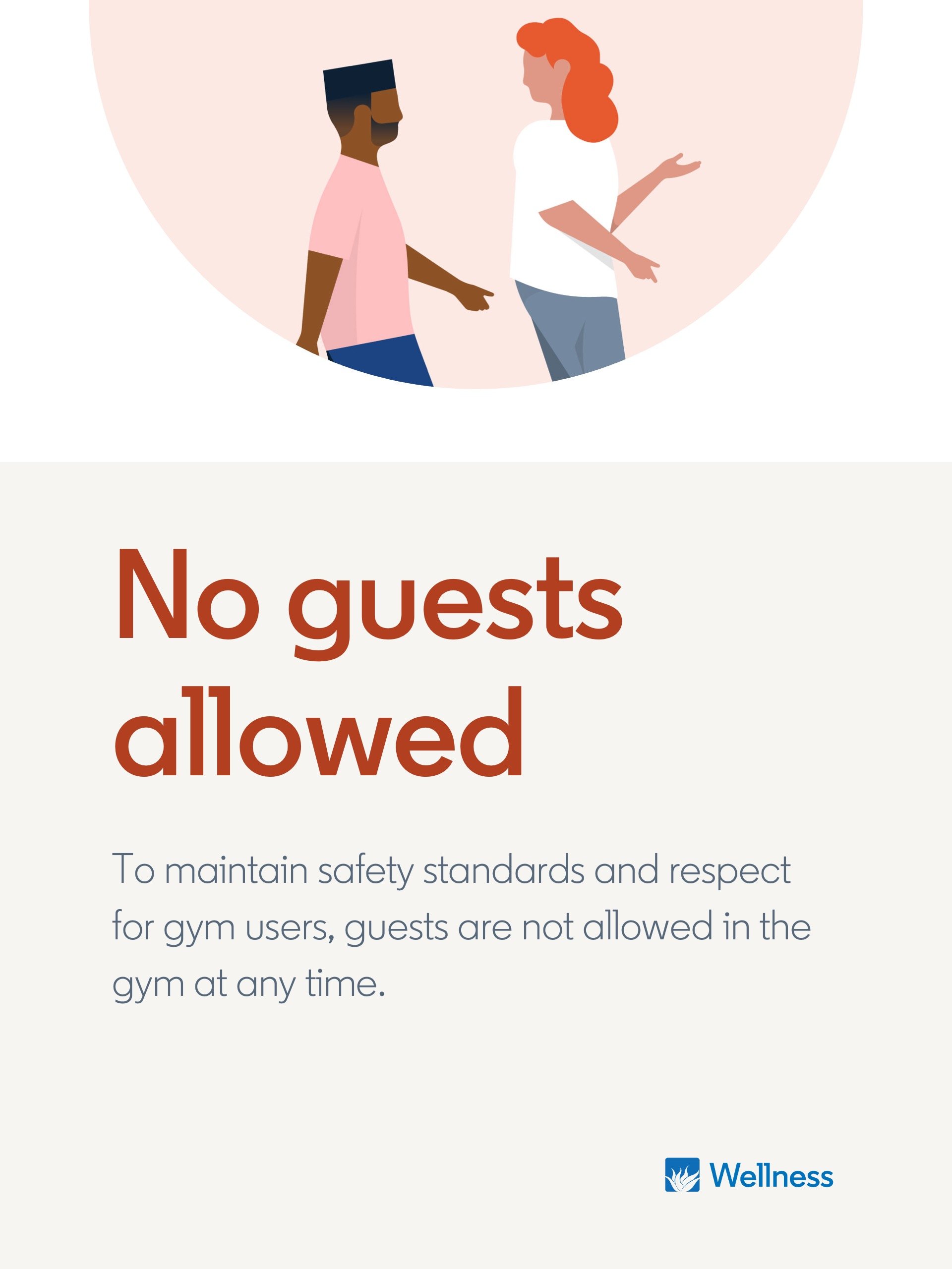
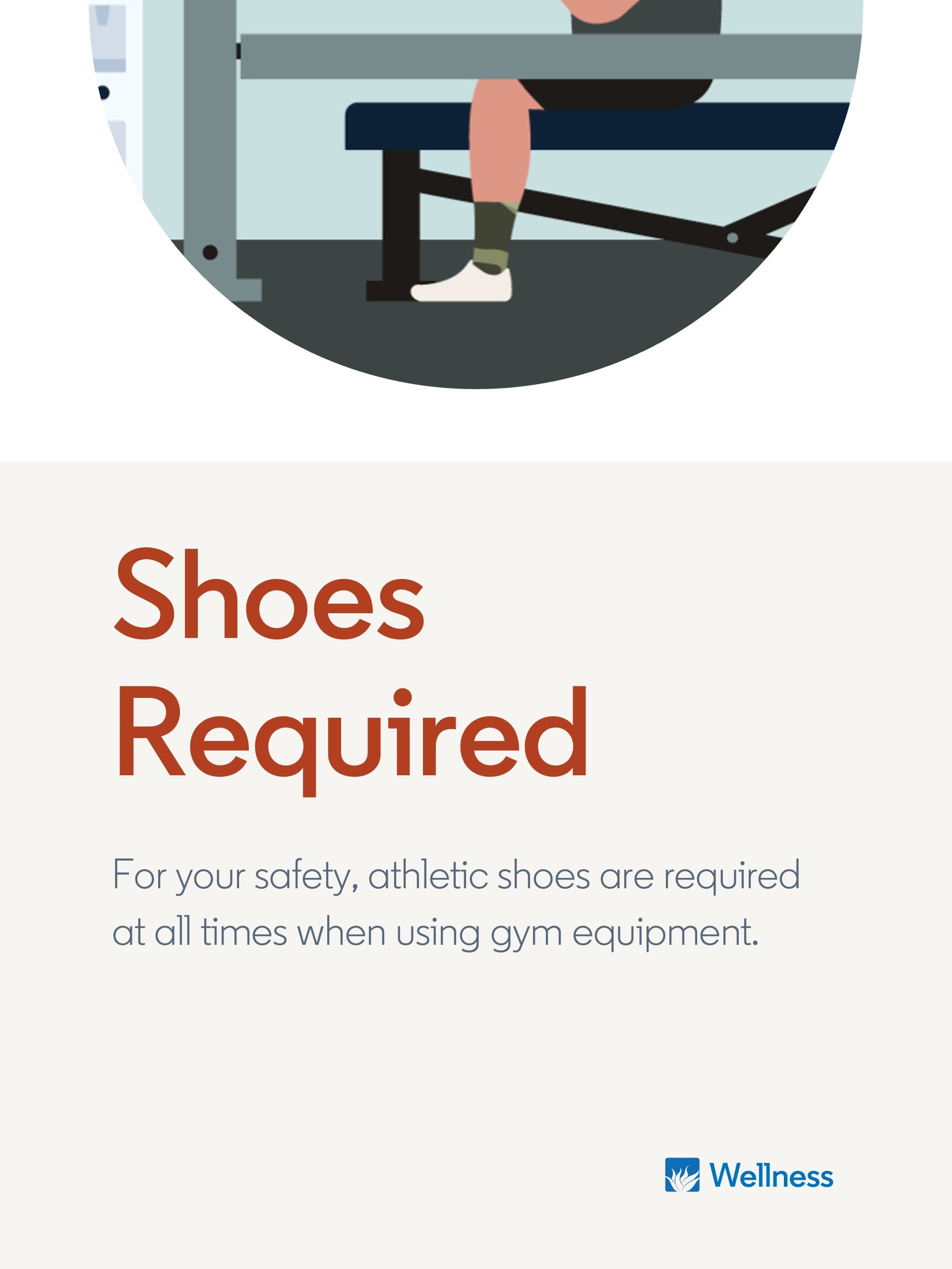


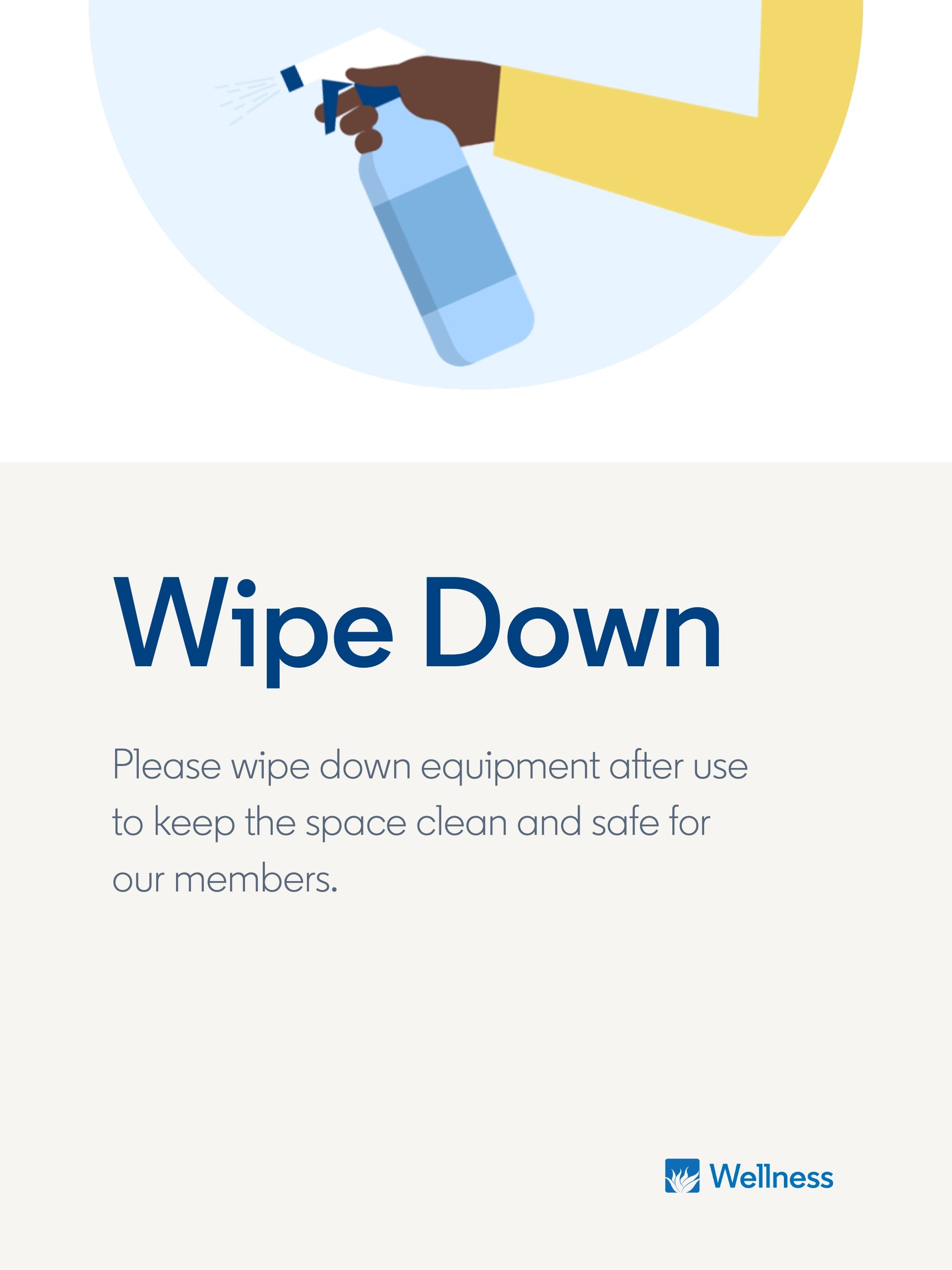

GYM SIGNAGE


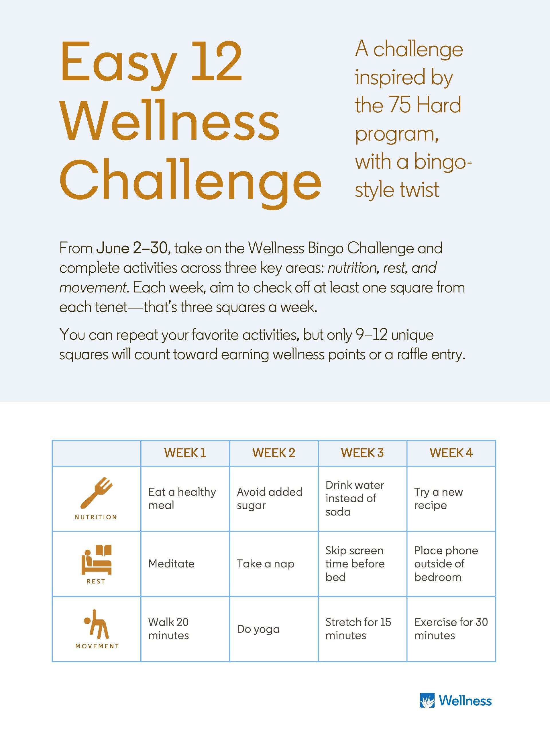

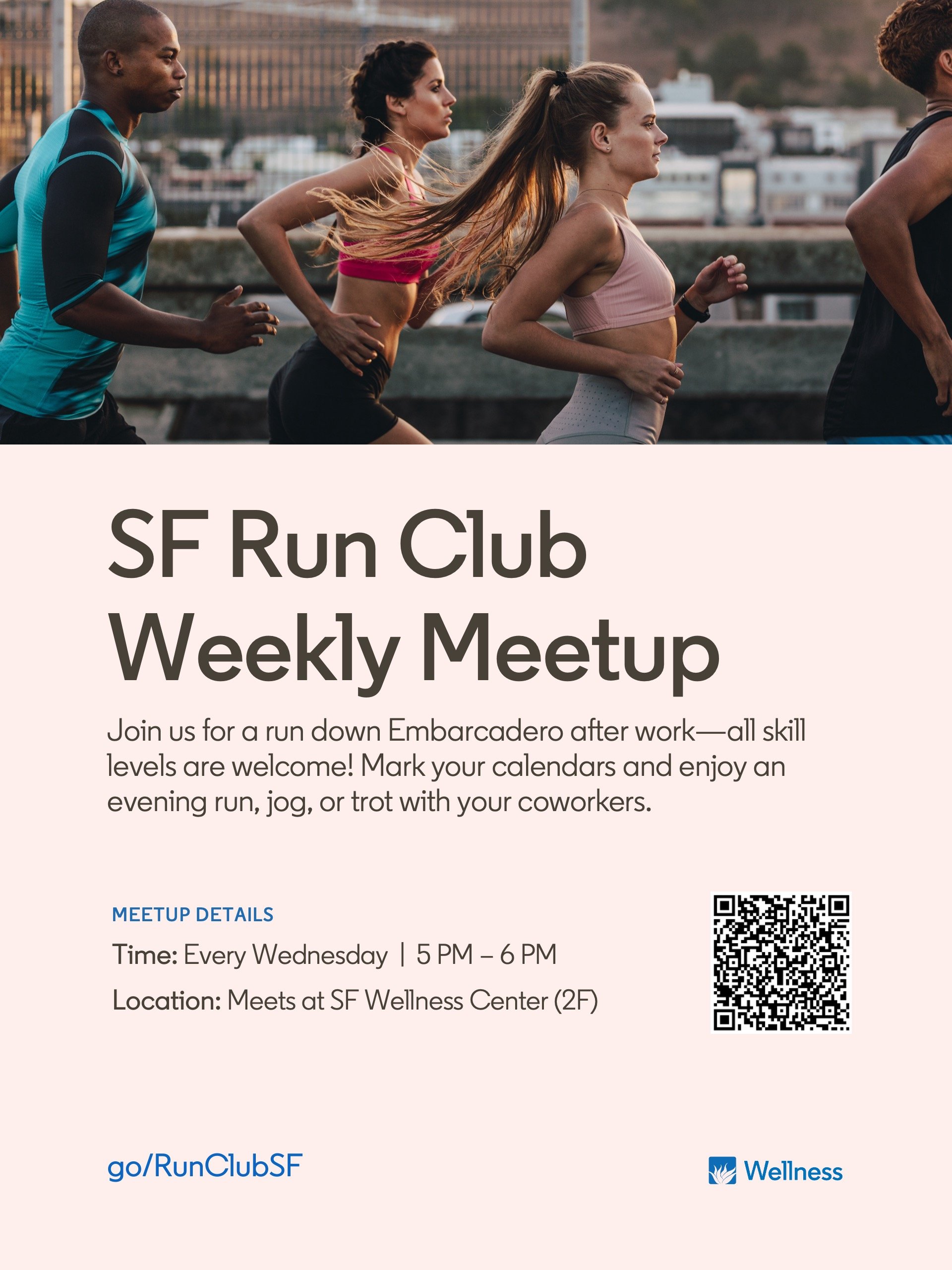


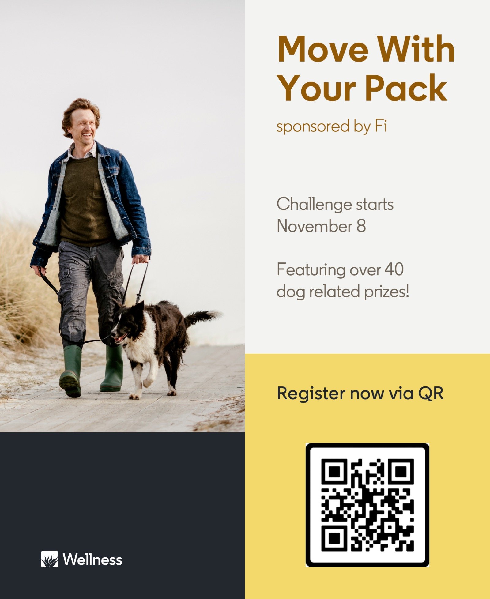

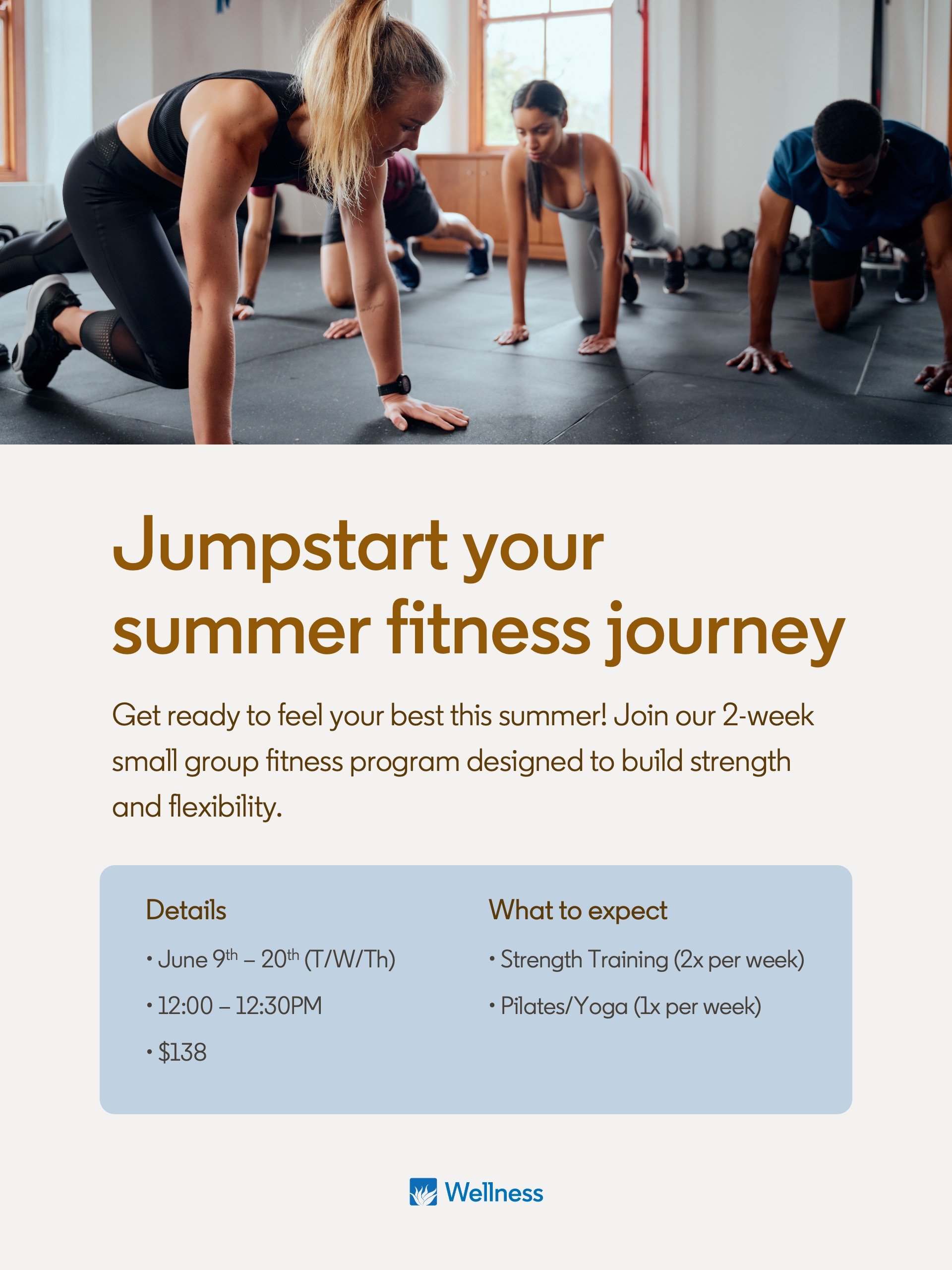

EVENT FLIERS


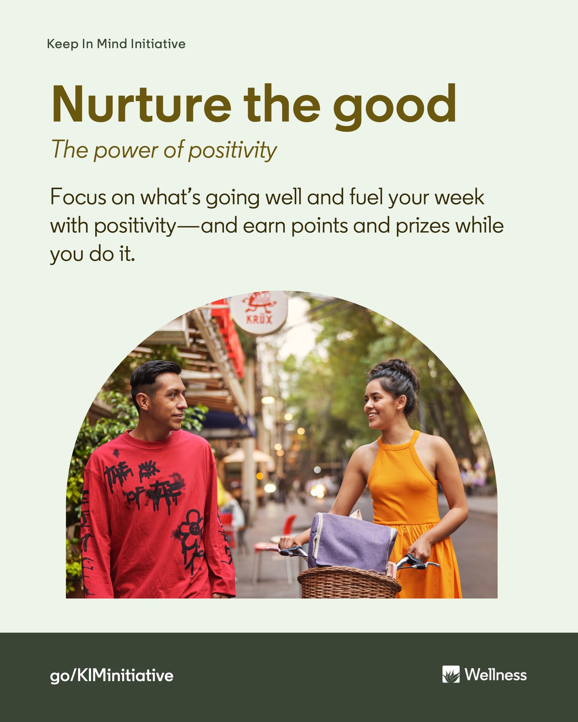
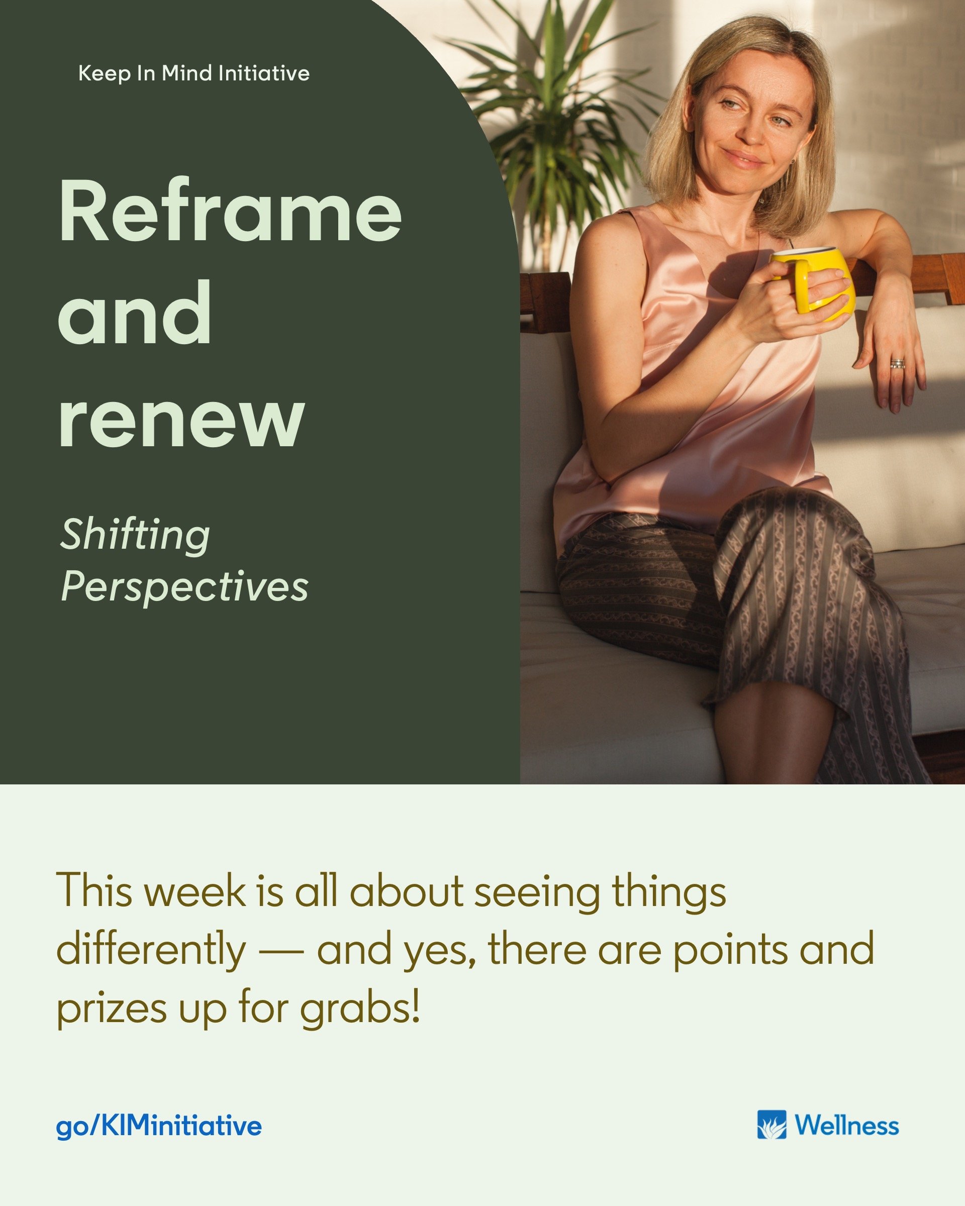
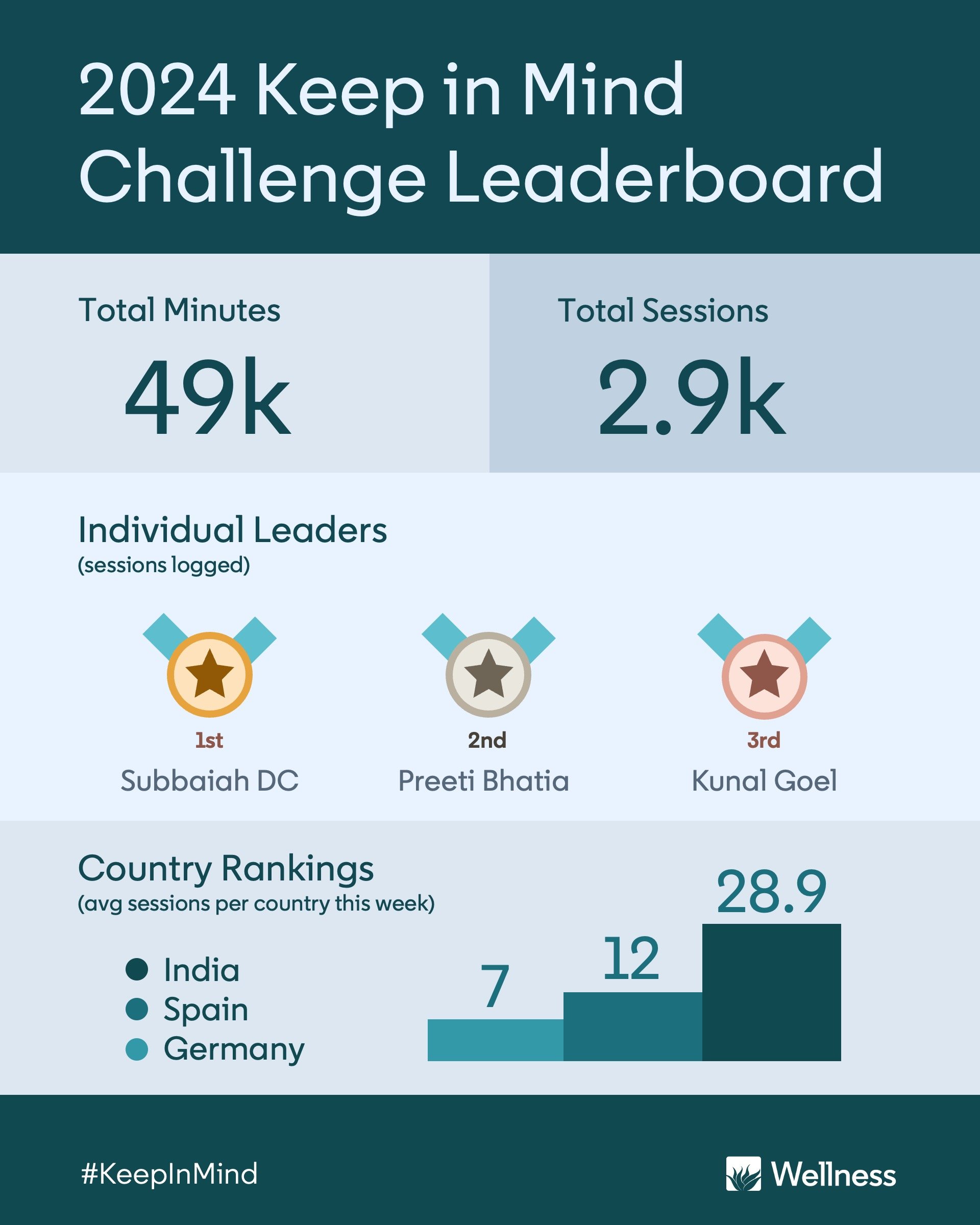


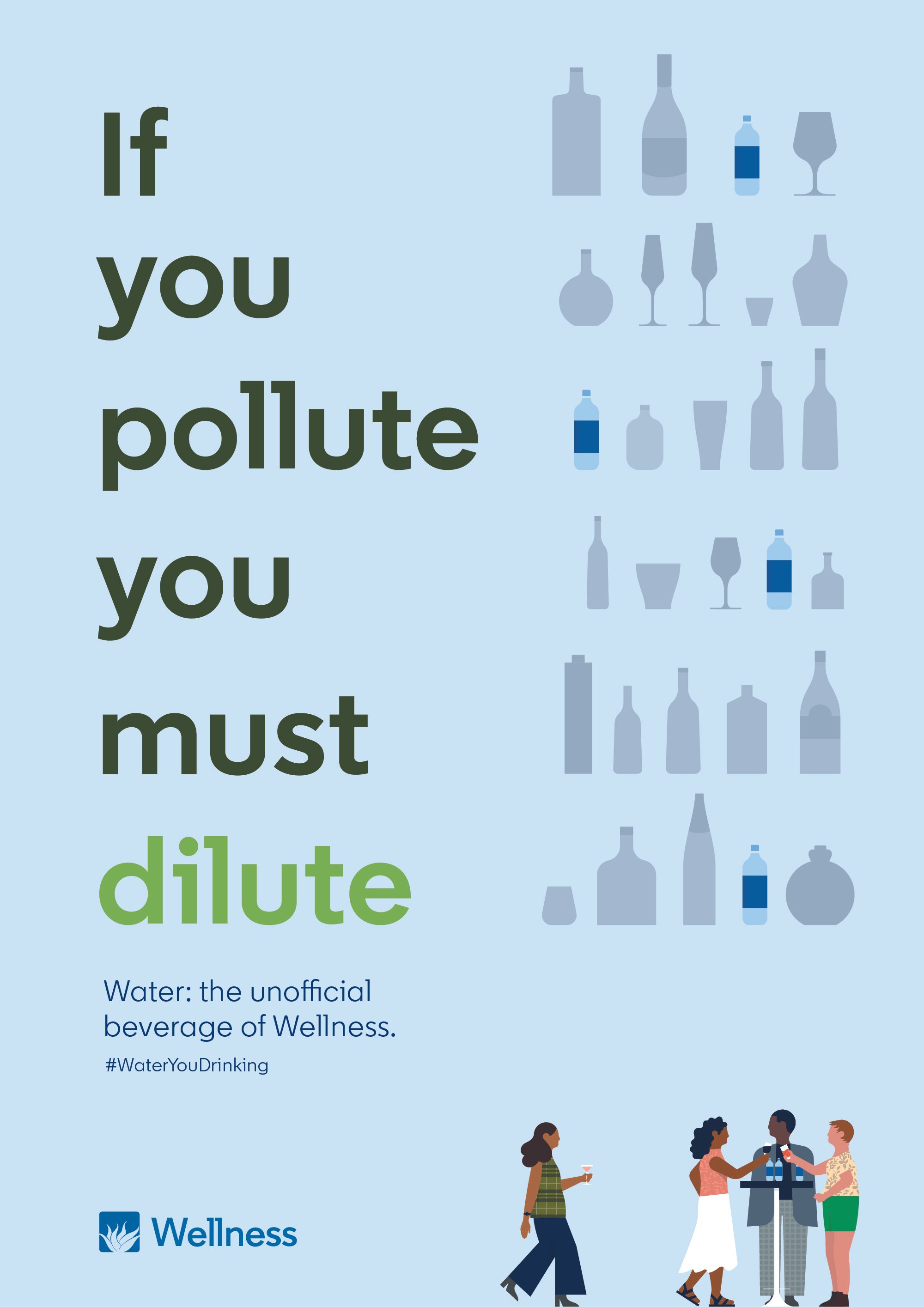
SOCIAL POSTS

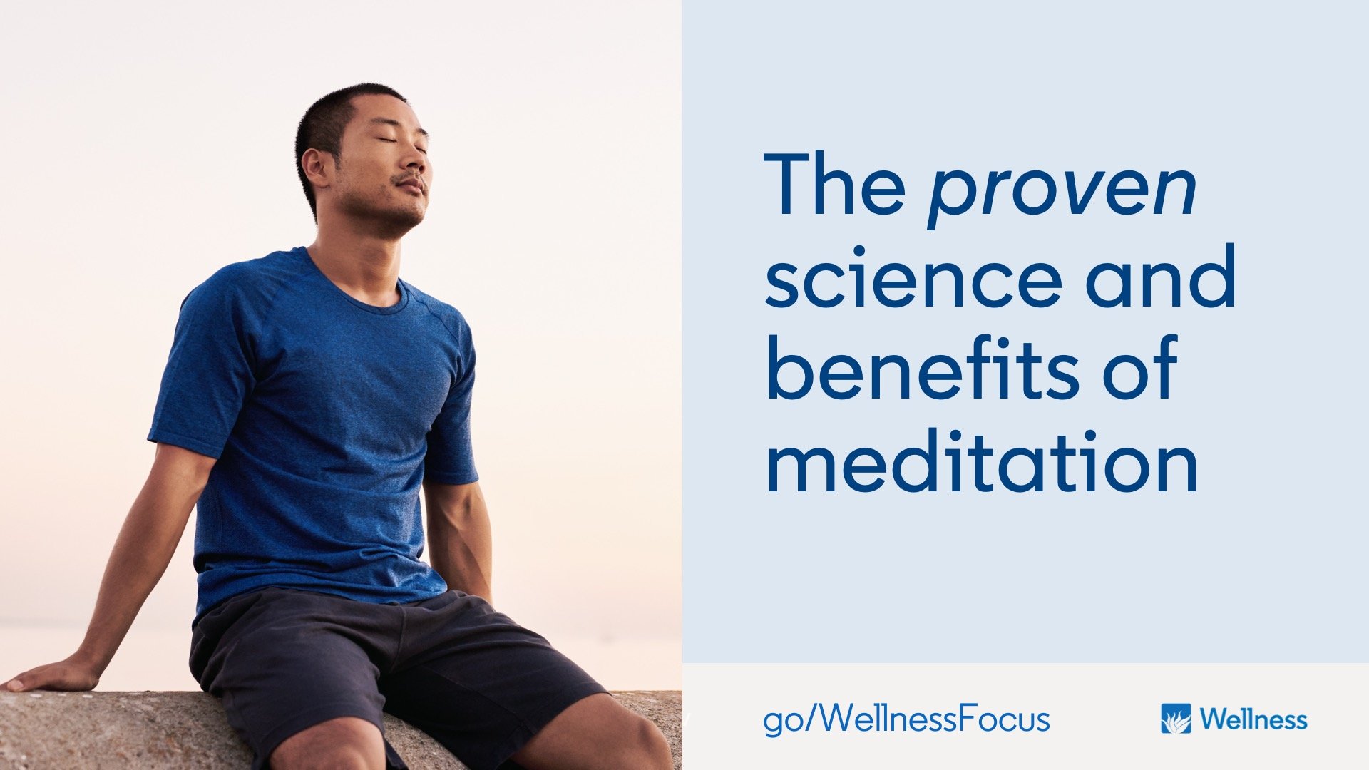

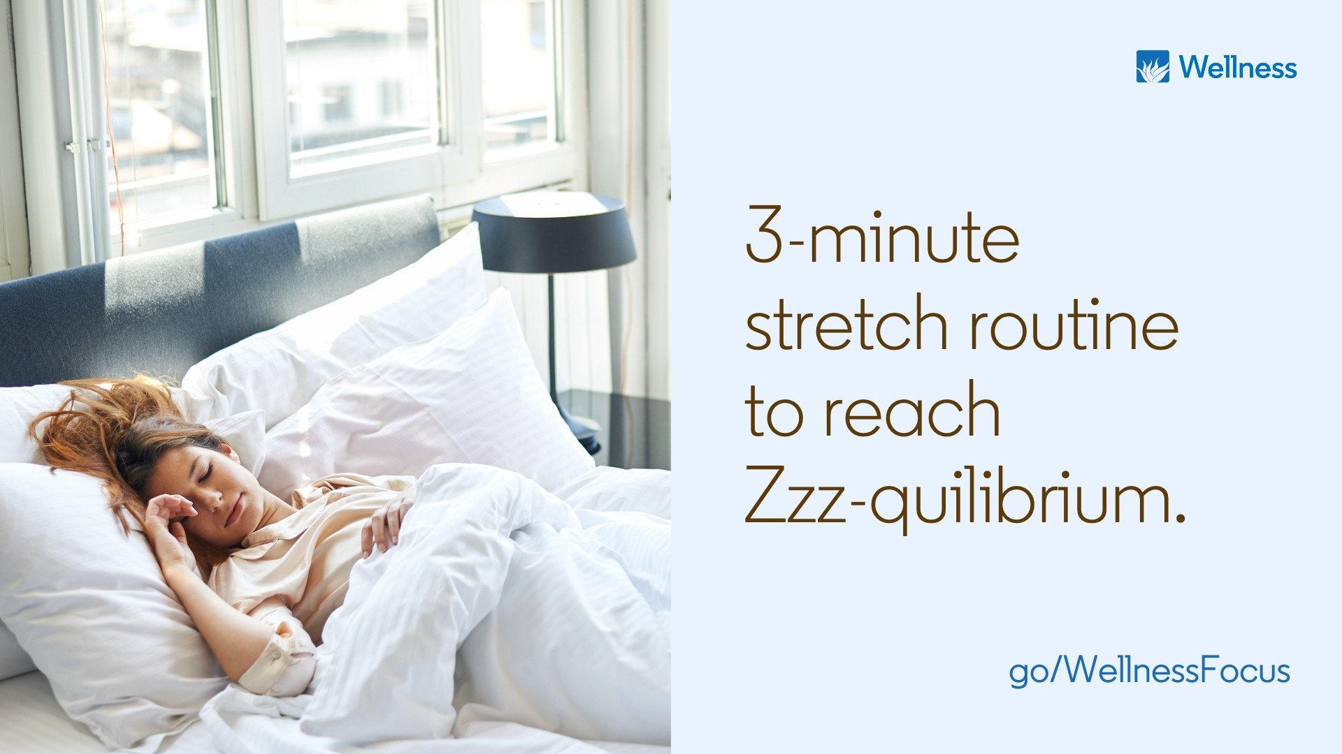

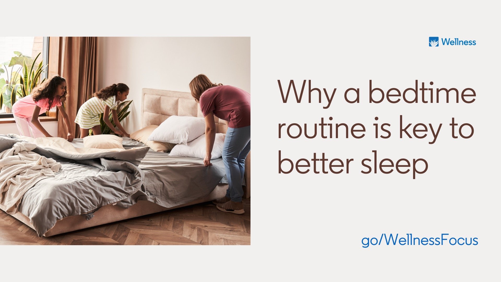

DIGITAL DISPLAY ADS
STICKER GIVEAWAYS
Honestly, aside from toddler parents, who doesn’t love stickers?


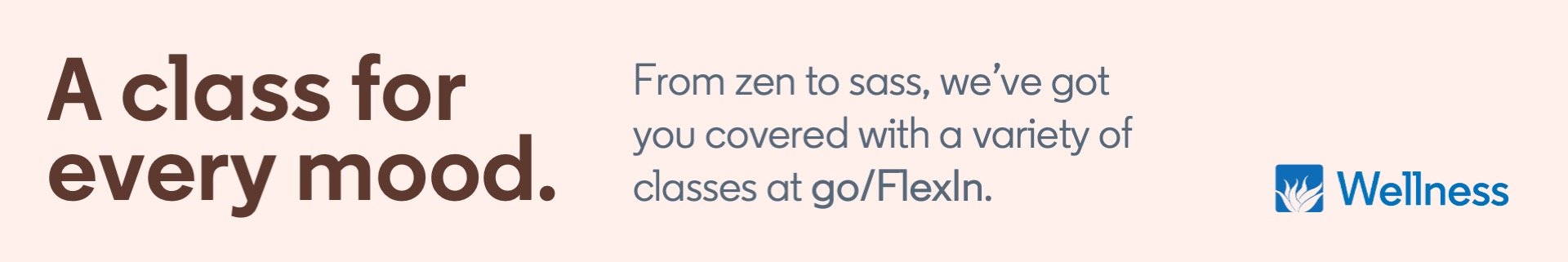


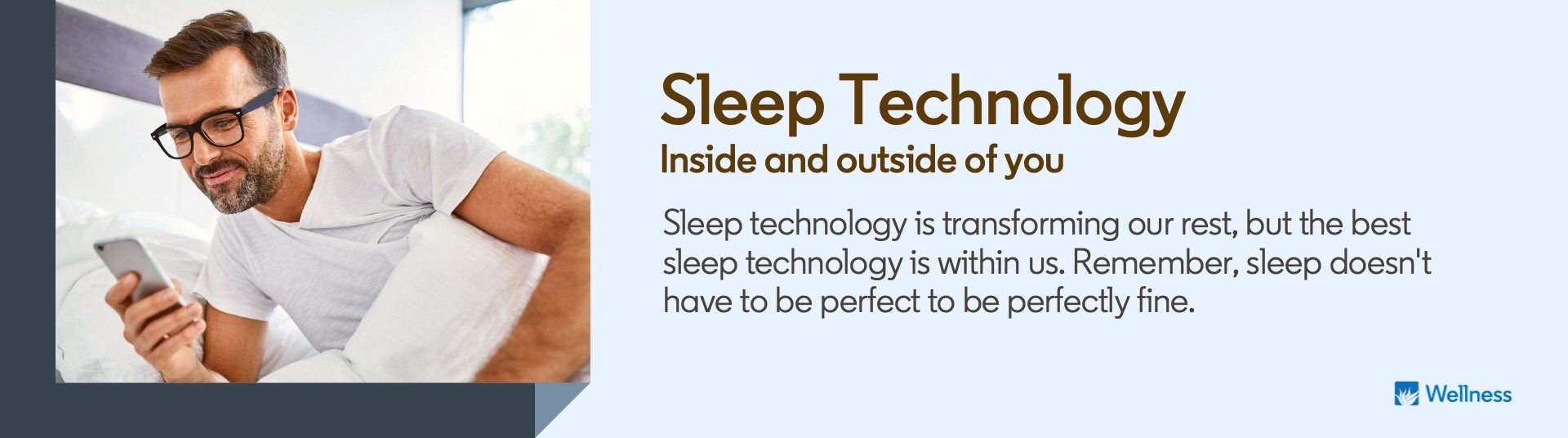

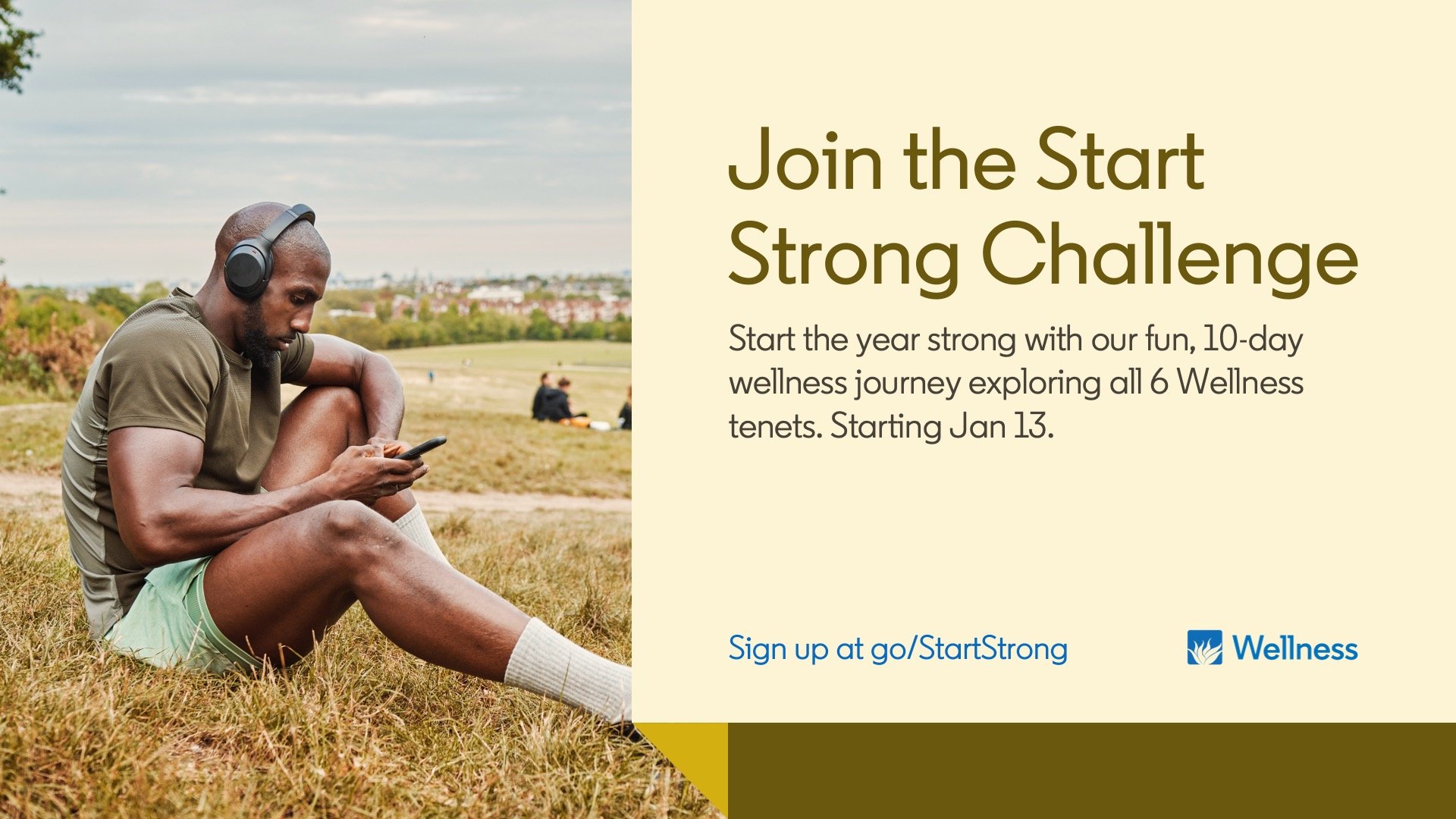
DIGITAL BANNERS
You get the gist.